Loop Analytics - Insights
Last updated: September 3, 2025
Loop has developed Insights to provide quickly and easily digestible snapshots of your data showcasing cost-saving opportunities. Insights can be accessed by clicking the tab on the left panel in Loop or by visiting app.loop.com/insights.
We are currently working to expand Insights, particularly on parcel, but it currently contains shipment and spend summaries, carrier and lane analysis, and specific insights based on transportation mode. You can read more about each specific module below.
If any previously available functionality is not available in Insights, please let your customer success manager know and we will work to replicate it.
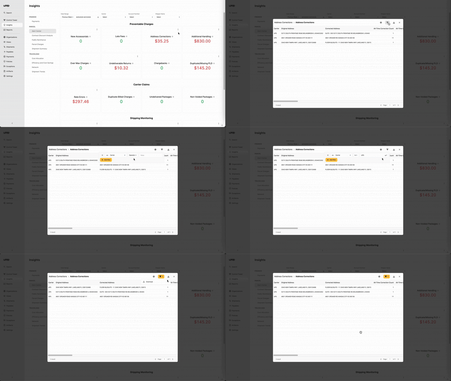
Throughout Insights, you can apply filters on the charts and visualizations, and on many charts, you are able to expose, filter, and download underlying data. Click the three dots on any chart to see which actions are available.

Parcel
Alert Center
We've built the alert center to serve as a canary in the coal mine for your parcel freight, notifying you of any potentially problematic trends in recent data that can be actioned by your team. The alert center can be filtered by date, carrier, account name, or shipper organization.
Tip: Hovering over the ⓘ next to any chart will display a quick description of how we calculate the accompanying data.
The Preventable Charges section displays fees that can often be corrected and avoided by internal processes. Carrier Claims shows insights into any filed claims against your carriers. Shipping Monitoring contains trackers for potentially fraudulent shipments, new accounts, and expedited charges. Tracking Exceptions notifies of any delayed shipments using parcel tracking data (Currently the tracking data that populates these charts is only available for UPS shipments).
Contract Discount Analysis
The Contract Discount Analysis section is intended to act as a playground or testing ground for contract discounts. This dashboard analyzes current accessorial rates and minimum charges and allows you to visualize how adjusting these will create savings in your network. The dashboard can be filtered by date, carrier, and accessorial type.
Accessorial Discounts displays the accessorials charged by your carriers along with your current discount and allows you to test different discount percentages to see potential savings. Minimum Charges shows the percentage of shipments where the minimum charge is applied and the average cost if minimums were not applied for each service type.
Parcel Charges
The Parcel Charges section provides summary values for your data: total packages, total spend, cost per package, etc, and it also gives the ability to see each charge on its own.
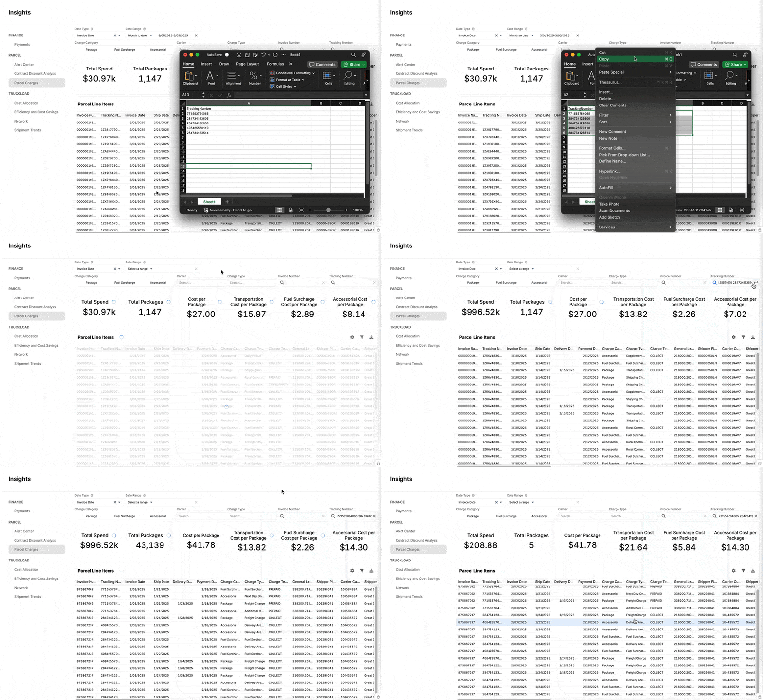
Parcel Charges can be filtered to become incredibly granular across date ranges, carriers, charge categories, specific charge types, and individual reference numbers.
Tip: You can paste a list of tracking numbers directly into the search to find multiple packages. The date filters will still override the search, so we recommend removing them to ensure all searched packages are visible.

Shipment Summary
The Shipment Summary dashboard breaks down your package volume by date, carrier, service type, and shipping zone. The charts can be filtered by all relevant dates, specific accounts, carriers, shippers, origins, and destinations.
The Service Type Summary breaks down your package volume across all services that you use. You can see and sort by total and average spend, days to deliver, cost per weight unit, and more. In Carrier Summary, we show how your average cost per package and total volume differ among your carriers. Shipping Zone Breakdown shows a heat map that visualizes your volume across service type and shipping zone and below, two interactive maps to visualize your packages by origin and destination.
Truckload
Cost Allocation
The Cost Allocation module is only available for clients whose shipments are assigned a GL code in Loop's audit. This dashboard shows how the volume and spend allocated to each cost center change over time.
Efficiency and Cost Savings
The Efficiency and Cost Savings dashboard combines accessorial analysis, LTL consolidation opportunities, and contract insights to provide you with the data to optimize your transportation spend. All charts can be filtered by pickup date, delivery date, or invoice issue date.
In Accessorials, we display the total accessorial spend during the provided date range, the percent change compared to the previous period, and a breakdown by accessorial category. LTL Consolidation Opportunities shows shipments for the same lane on the same day and shipments from the same shipper on consecutive days.
Network
The Network tab provides deeper insights into your carrier network and lane analysis. The charts can be filtered by pickup date, delivery date, audit date, or approval date, transportation mode, vendor, and specific city-to-city lane.
The top-level charts provide headline numbers for your shipment volume and spend, and toggling the date grouping will change to show the values over years, months, weeks, or days. In the Vendor Overview, you can see the number of different vendors in your network, the shipment volume for the top ten, and a breakdown of each vendor's volume, overcharge percentage, and accessorials. Lane Overview shows similar data for city-to-city lanes and maps visualizing your top origins and destinations.
Shipment Trends
In Shipment Trends, you can find an Overview of your shipment volume and spend by mode. This can be filtered pickup, delivery, approval, or audit date, vendor, and customer.
Audit Results shows findings from your Loop's audit process including overcharges and undercharges along with a breakdown of overcharge percentage and overcharges by vendor.
Finance
Payments
The Payments dashboard is created to show all data from your payments in one place. The data can be filtered by payment initiated date, payment completed date, scheduled for date, or approved date, as well as by payee, payment status, and whether the payment was quickpay.
Tip: Filtering by Quick Pay is useful to ensure your payments are being processed within the necessary timeframe.
In Payments by Status, you will see a chart displaying all payments attempted through Loop by their status. This is the only chart that will not adjust with date filters. Below this, we display charts showing total payment volume through Loop broken down by date and rail, Quick Pay Savings, and the average time from invoice approval to payment initiation and initiation to completion. Finally, we will display a table of all failed payments that can be filtered and downloaded independently.