Charts and Visualizations
Last updated: April 10, 2026
Interacting with Charts
You don't need to build anything to get value from charts. As a standard user:
Hover over any data point to see exact values in a tooltip
Click a bar, slice, or point to filter the rest of the page to that selection
Click the legend to show or hide specific categories
Click blank space to reset any active selections
Three-dot menu (⋮) → download as PNG, view underlying data, or set an alert
Double-click to open the full underlying data table
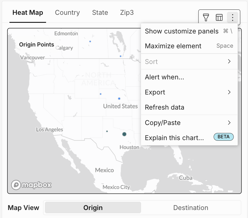
Chart Types in Intelligence
Chart type | Best used for |
Bar chart | Comparing values across categories (e.g., spend by carrier) |
Line chart | Tracking a metric over time (e.g., weekly spend trends) |
KPI tile | Highlighting a single key number (e.g., total spend) |
Donut chart | Showing parts of a whole (e.g., spend by mode) |
Combo chart | Comparing two metric types together (e.g., volume + cost per unit) |
Gauge chart | Measuring progress toward a goal (e.g., on-time performance %) |
Map | Visualizing data geographically (e.g., shipment density by ZIP3) |
Building a Chart (Explore Access Required)
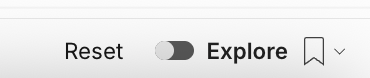
On a report page, toggle Explore to on ->
-> click + to add a new element and select Chart
Connect the chart to your data source
In the Properties tab on the right, choose your chart type
Assign your columns: X-axis (category or date), Y-axis (number or measure), and optionally a Color dimension to break out a third dimension
Switch to the Format tab to adjust titles, colors, labels, and axes
Save to a custom view
Pro tip: Add a reference mark (a horizontal line) to show your OTP goal or average cost benchmark — it makes it immediately obvious when you're above or below target.
Turning on Explore mode
Every report in Intelligence has a toggle that switches between View mode (read-only) and Explore mode (fully customizable). To get started:
Open any report page
Navigate to the report you want to customize — for example, Supply Chain Intelligence or a Standard Report.
Toggle Explore to on
Find the Explore toggle in the report toolbar and switch it on. The page will shift into edit mode — you'll see new controls appear, including a + button for adding elements and editing options on existing ones.
Any changes you make in Explore mode only affect your session until you save them. If you want to undo everything and go back to the original report, scroll to the bottom and click Reset — or simply navigate away without saving.
Adding elements to a report page
With Explore mode on, click the + button anywhere on the page to add a new element. You'll be prompted to choose what type of element to add:
Data
Add a table showing raw or summarized shipment data
Chart
Add a bar, line, pie, map, or other visual chart
Control
Add a filter control so viewers can slice the data themselves
UI
Add text, images, dividers, or other layout components
Layout
Add containers to organize elements into sections or columns
Common calculations for logistics data
What you want | Calculation | Example |
Total freight spend | Sum | Sum of all charge amounts |
Number of shipments | Count | Count of tracking numbers |
Average cost per shipment | Average | Average of total spend per row |
Transit time | Date difference | Days between pickup date and delivery date |
Flag high-cost shipments | If / Then | If total spend > $500, show "Review" |
Parcel as % of total spend | % of Total | Parcel spend ÷ all-mode spend |
Group shipments by month | Date truncation | Truncate ship date to month |
Saving, sharing, and resetting
Saving a custom view
When you're done building, scroll to the bottom of the page and click Save as Custom View. Give it a name — it will appear under File → Custom Views → All Views and can be set as your default view for that report.
Custom views save everything in your current session: active filters, column selections, added elements, calculations, chart configurations, and layout changes.
Custom views are personal by default — only you can see them. To make a view available to your whole team, contact your admin to set it up as a shared view.
Resetting to the original report
To undo all changes and return to the published version of the report, scroll to the bottom and click Reset. This clears everything — filters, added elements, column changes, and layout modifications. You can also simply navigate away from the page without saving.
Reset is a full undo — it cannot be reversed. If you want to keep your work-in-progress, save it as a custom view first before resetting.
Pro tips for Explore mode
Add a reference mark to show your OTP goal
In the Format tab of any line or bar chart, add a reference mark — a horizontal line — set to your on-time performance target (e.g., 80%). This makes it immediately obvious at a glance when you're above or below your goal, without having to read the axis numbers.
Use grouping to go from shipment-level to summary in one click
In any data table, apply grouping to a field like Carrier or Week to instantly collapse thousands of shipment rows into a clean summary. Pair it with a Sum or Average calculation to get totals per group. This is the fastest way to build a carrier spend summary without building a report from scratch.
Combine a chart and a table on the same page
Add both a chart element and a data table to the same page view, connected to the same data source. When you filter the chart by clicking a bar or slice, the table updates to show only the records behind that selection — giving you visual context and row-level detail at the same time.
Build a recurring report once, then schedule it
Build your custom view in Explore mode, save it, then set up a scheduled export from the report menu. The export runs automatically on your chosen cadence and delivers the custom view to the right inbox — without you needing to open Intelligence each time.
Use pivot columns for carrier-vs-carrier comparisons
In the Properties tab, use the pivot column feature to break out a metric by carrier across columns — for example, total spend as rows (by week) with each carrier as its own column. This is the fastest way to build a side-by-side carrier comparison table for a business review.