Supply Chain Intelligence
Last updated: April 10, 2026
Your logistics command center
What It Is
Supply Chain Intelligence is your top-level dashboard for understanding what's happening across your entire freight operation. It gives you a unified view of spend, shipment volume, carrier usage, and cost trends — across all modes, all carriers, and all business units — in one place.
Best for answering: "What is happening across my logistics operations right now?"
Who should use this: Finance and operations leaders, transportation managers, anyone who needs to track freight spend and carrier performance.
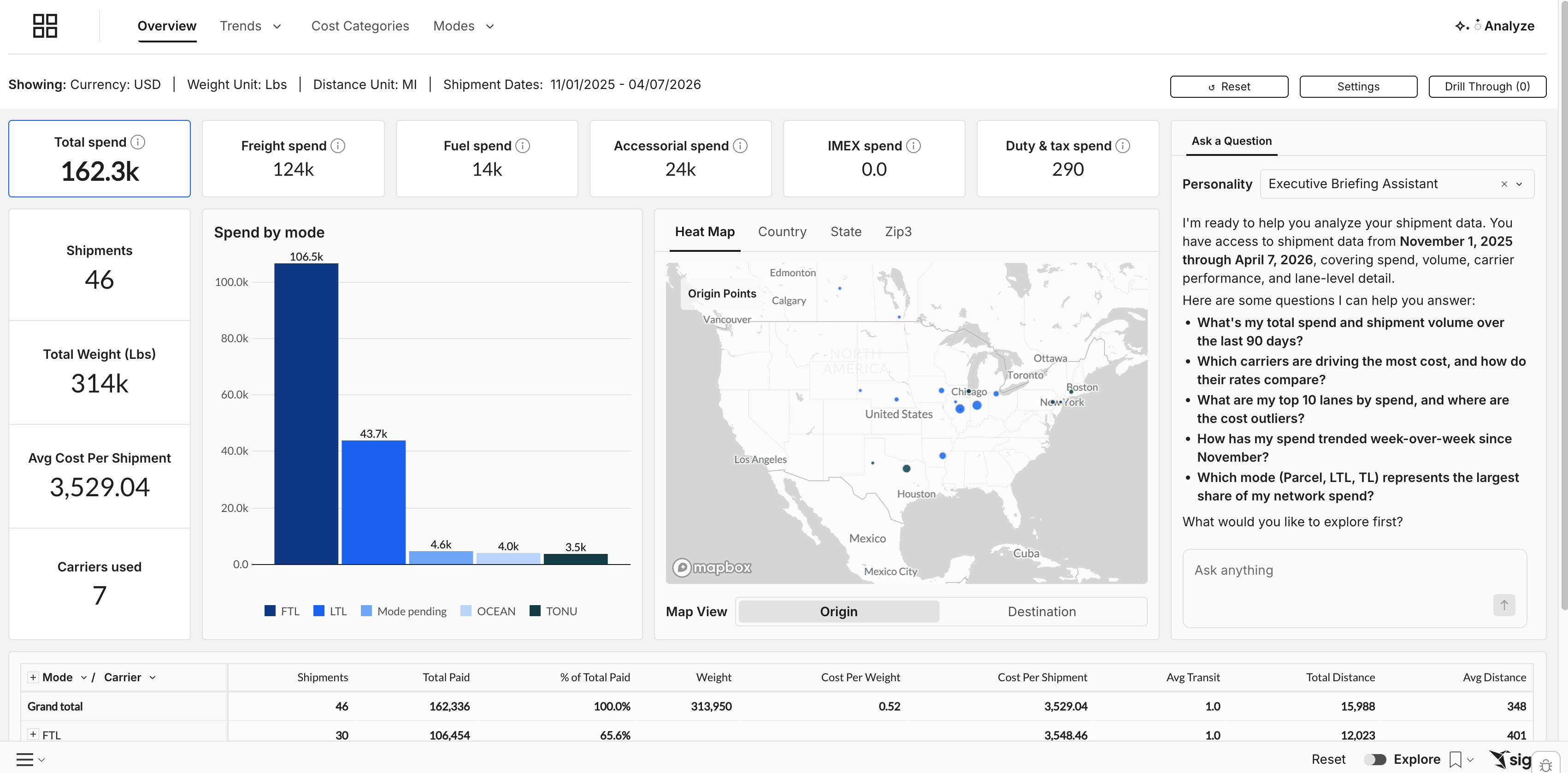
Overview Tab
Top KPI Tiles
Six key metrics sit at the top of the page:
Tile | What it shows |
Total Spend | Your all-in freight cost across all modes and carriers for the selected period |
Freight Paid | Core transportation charges (linehaul) — excludes fuel, accessorials, and fees |
Fuel Paid | Total fuel surcharge spend |
Accessorial Paid | All accessorial charges combined (liftgate, residential, address correction, etc.) |
IMEX Spend | International import/export charges |
Duty & Tax Spend | Customs duties and taxes |
How to use it: Start here at the beginning of each week or month. A spike in Accessorial Paid might mean carriers are adding new fees. A jump in Fuel Paid often tracks with diesel index changes. These tiles tell you where to dig in next.
Ask a Question — AI Assistant
Each tab includes a built-in AI assistant. Type a question in the chat panel on the right side of the page and get an answer based on your current data and filters — no report building required. See the AI Features article for example questions and tips.
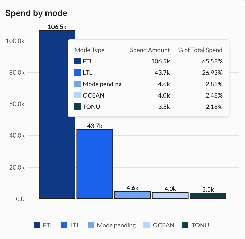
Spend by Mode
Shows how your total spend breaks down across parcel, LTL, FTL, intermodal, and other modes.
How to use it: Quickly assess your mode mix. Hover over any bar and select "Show Underlying Data" to see the shipment-level records behind it.
Mode by Carrier Table
A breakdown of shipment volume, total spend, cost per shipment, cost per weight, and average transit time — grouped by mode and carrier.
How to use it: Benchmark carriers against each other. Sort by "Cost Per Shipment" to quickly see who's most and least expensive.
Note on Parcel Service Types: For parcel, Loop aggregates carrier service types into a standardized label called Loop Service — making it easier to compare performance across carriers. To see the original service types as reported by the carrier, filter to "Service Type" in Report Controls or click the + icon next to any Loop Service row to expand into the carrier service detail.

Heat Map
A geographic visualization showing where your shipments originate and how dense your activity is by region.
How to use it: Identify your highest-volume origin zones — those are your priority lanes for carrier negotiations. Toggle between Country, State, and ZIP3 views for different levels of geographic detail.
Trends Tab
The Trends tab shows how your costs and volume change over time. Toggle between Cost Per and Spend & Volume at the top of the tab.

Cost Per
Tracks how much you're paying per shipment or per pound over your selected date range.
You can view this data three ways:
Overall — a single blended trend across all modes and carriers
By Mode or Carrier — see how individual carriers or modes are trending
Summary — a table showing cost per pound by carrier and by month, useful for period-over-period comparisons
How to use it: If your cost per shipment is trending up but volume is flat, your rate structure may be drifting. Use the Summary table for a clean month-by-month breakdown to bring into your next carrier review.
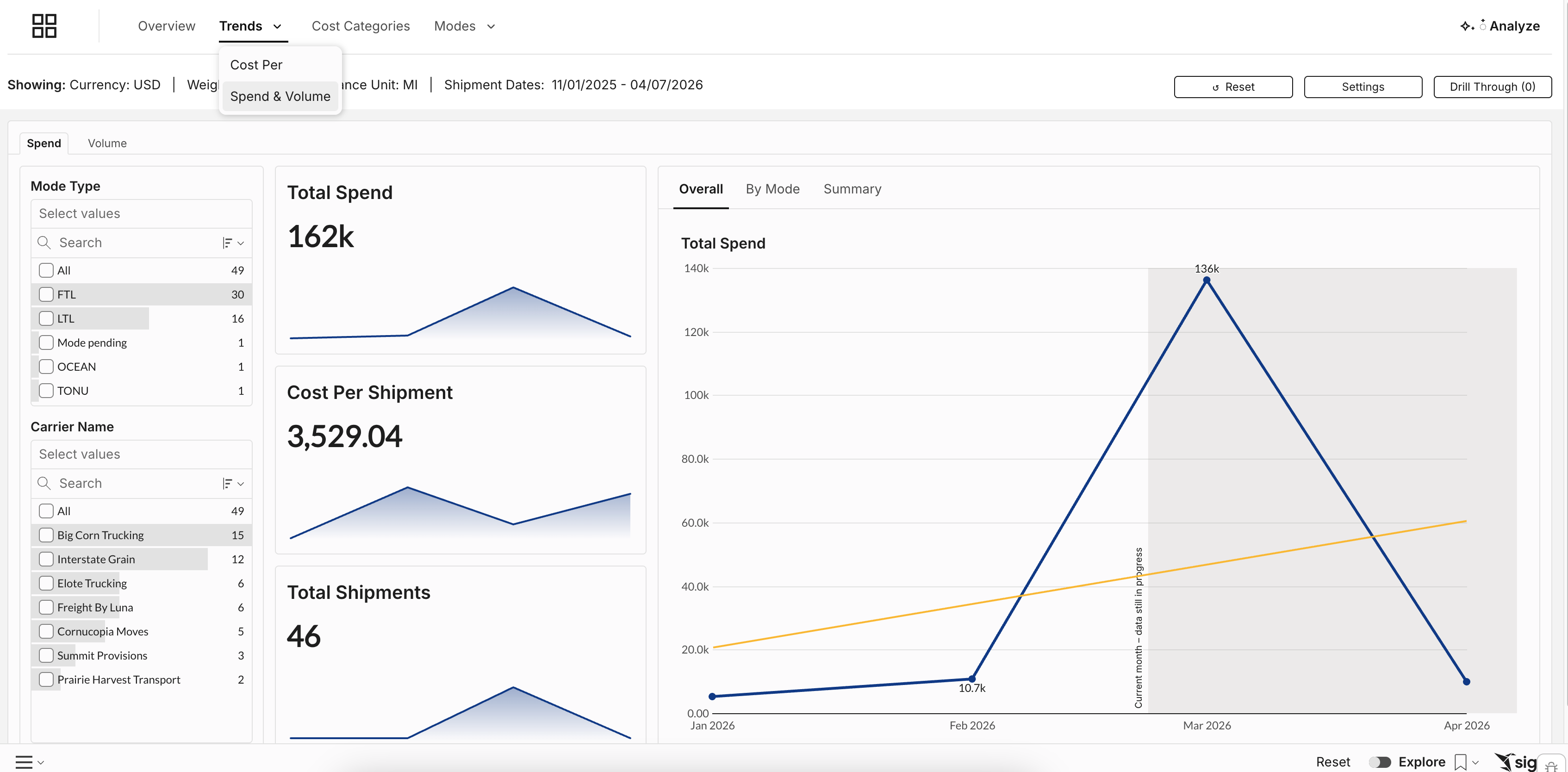
Spend & Volume
Side-by-side view of total spend and shipment count over time. Mirrors the same Overall / By Mode or Carrier / Summary views as Cost Per.
Example: Spend went up 12% last month but volume was flat. That means your average cost per shipment increased — head to the Cost Categories tab to find out what's driving it.
Cost Categories Tab
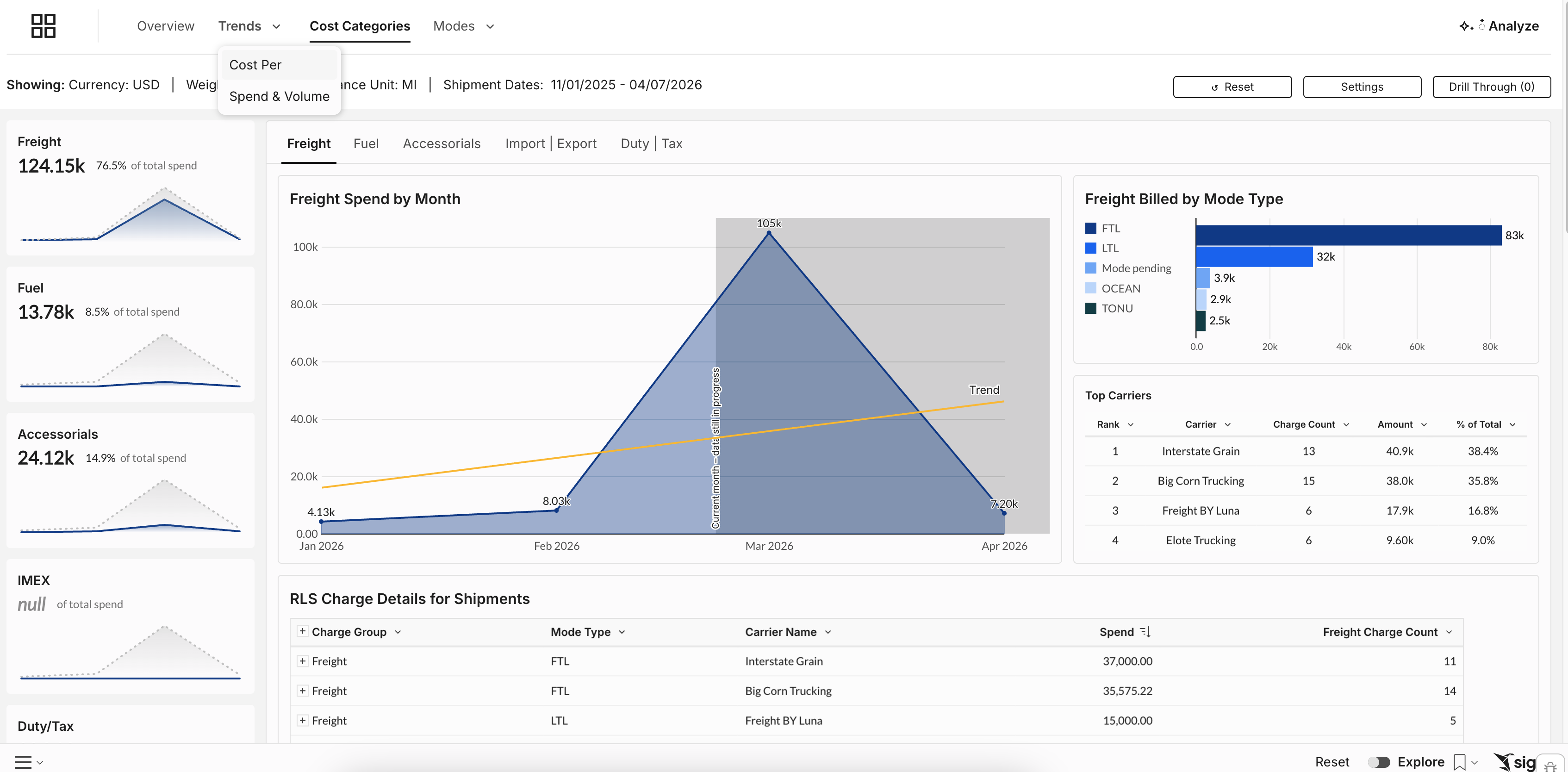
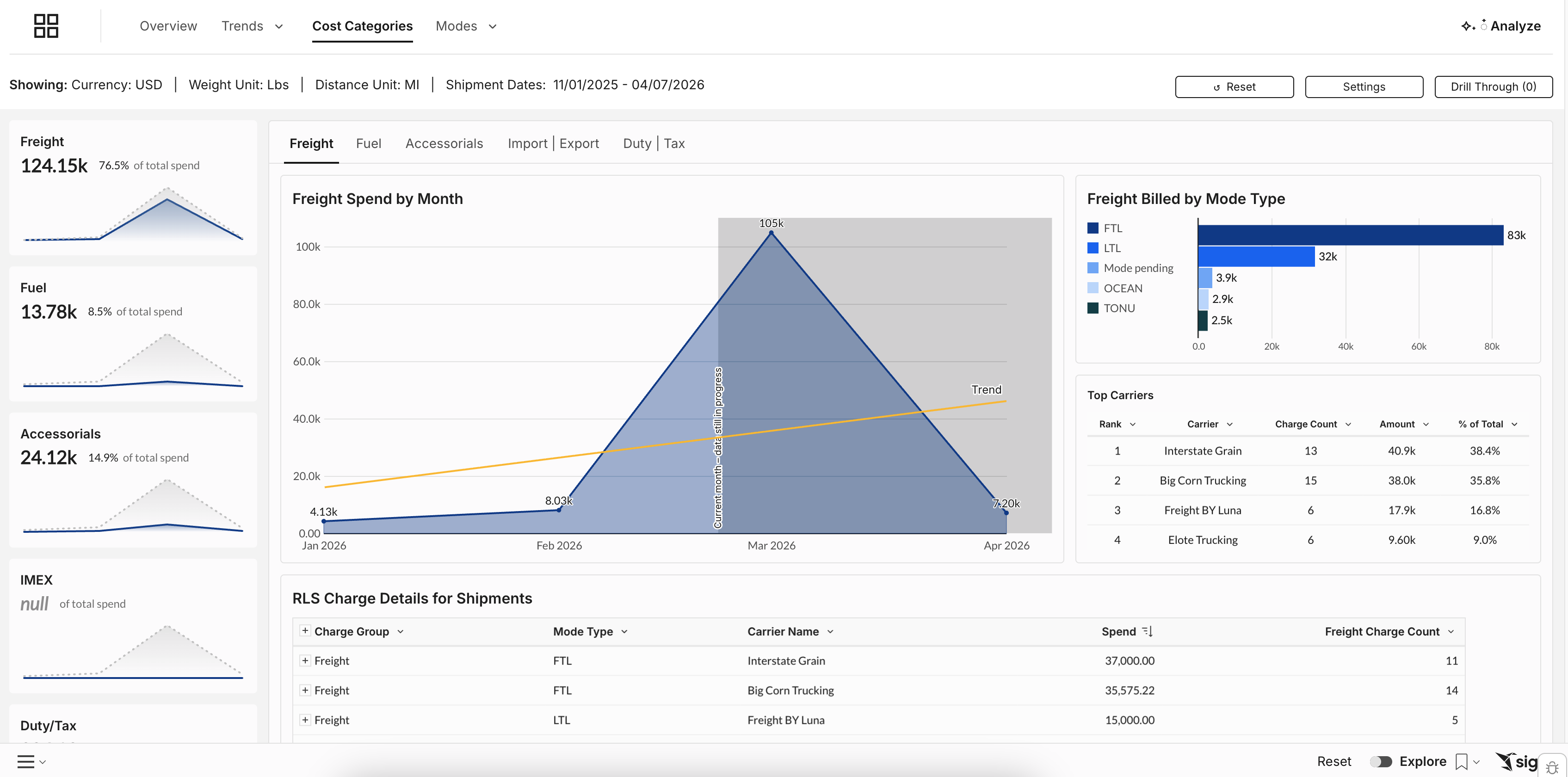
Breaks your total spend into component parts — freight, fuel, accessorials, import/export, and duty & tax — shown over time so you can see which categories are growing.
How to use it: Monitor whether accessorials are growing as a share of total spend. If you're seeing it here, head to the Alert Center to set up automatic monitoring.
Modes Tab
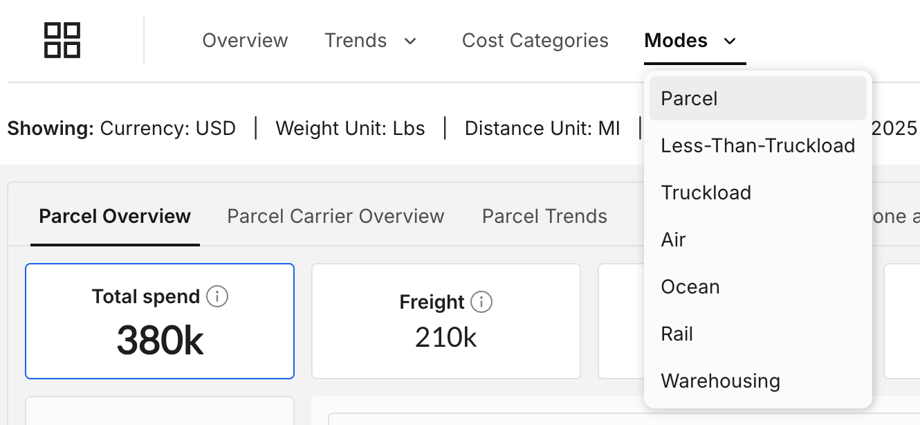
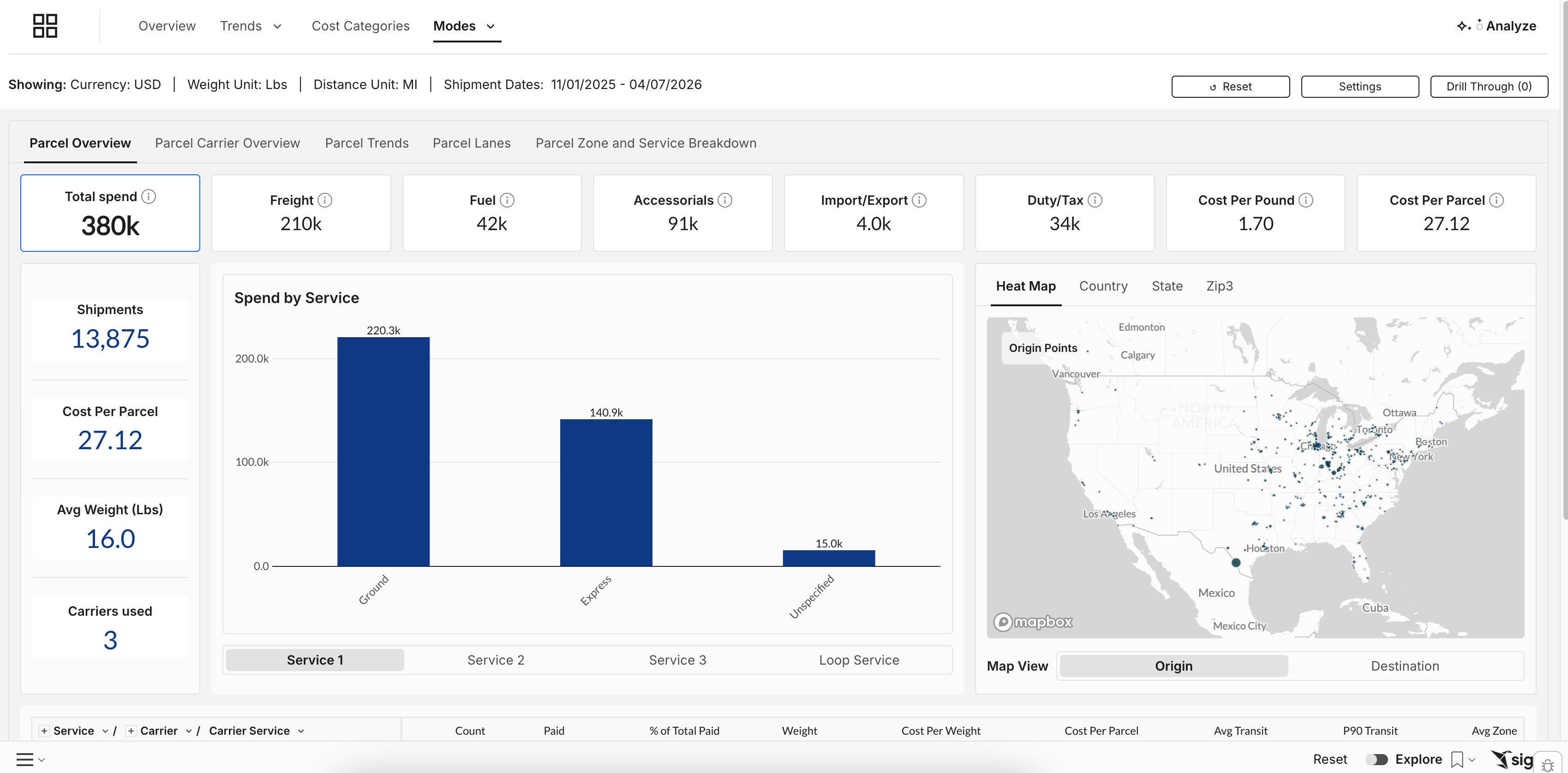
Detailed breakdowns for each shipping mode you have onboarded to Loop — Parcel, LTL, Truckload, Air, Ocean, Rail, and Warehousing.
Each mode tab includes its own Overview, Carrier Overview, Trends, and Lanes sub-tabs — focused entirely on one mode at a time.
How to use it: Use the mode tabs when you need to go deep on a specific part of your freight program. If your LTL spend jumped last quarter, open the LTL tab and go to Lanes to see which origin-destination pairs are driving it.
Pro tip for Parcel: The Parcel mode tab includes a Zone and Service Breakdown showing how your parcel spend distributes across shipping zones (1–8) and service levels. Zone is one of the biggest drivers of parcel cost — if a large share of your volume is shipping Zone 7 or 8, that's a signal to look at inventory positioning or carrier zone skipping programs.
Common Use Cases
Monthly business review: Filter to the prior month → screenshot the top KPI tiles and Spend by Mode chart → use the Mode by Carrier table to pull carrier-level totals. A full freight spend summary in under 5 minutes.
Carrier performance comparison: Open the Mode by Carrier table → sort by "Cost Per Shipment" → compare your top carriers on the same mode. If one carrier is consistently more expensive with no transit time advantage, that's a concrete data point for your next contract review.
Identifying a spend anomaly: Open the Trends tab → spend went up but volume didn't → switch to Cost Categories — accessorials jumped 12%. Head to the Alert Center and drill into "New Accessorials" to find out which fee appeared.
Preparing for a carrier negotiation: Use the Mode by Carrier table to pull 6-month averages. Use the Trends → Summary table to show month-by-month direction. Export as PDF directly from Intelligence — no manual data compilation needed.